


 SkilzHub Certification
 Adobe Certification
 Google Certification
 Meta Certification
 Semrush Certification
 Hubspot Academy Certification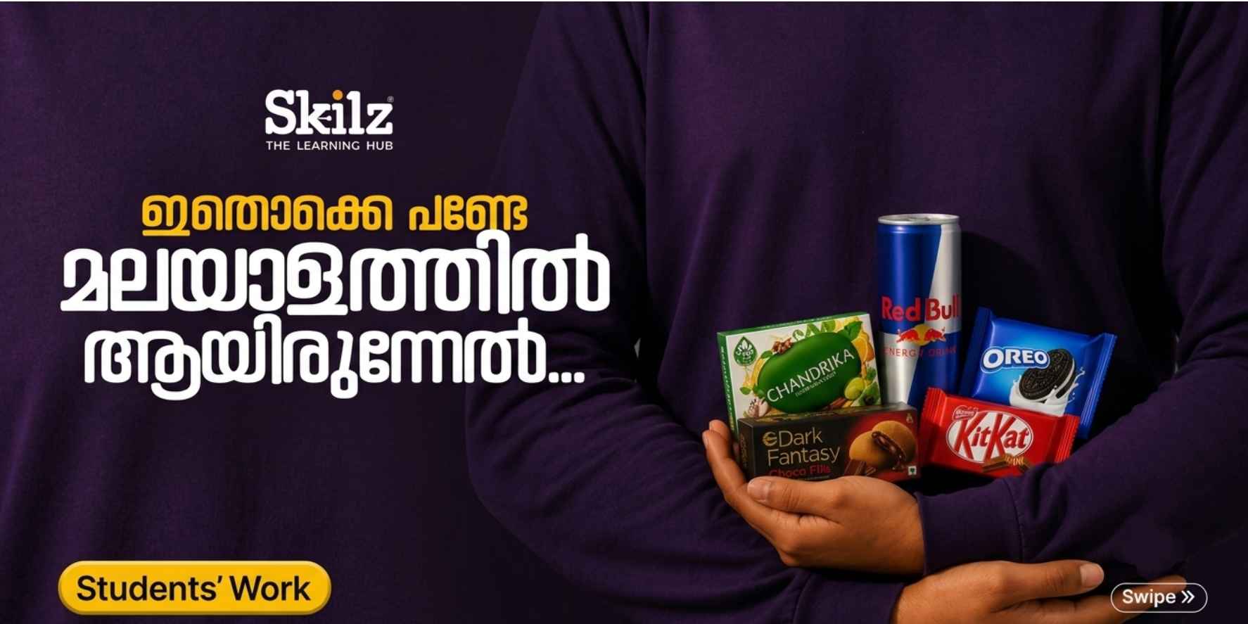
When Malayalam Meets Global Brands: How Skilz Hub Students Went Viral
What happens when the packaging of the world's most recognizable brands gets reimagined through local script and craftsmanship? You get a campaign that stops people mid-scroll, and that's exactly what a group of graphic design students recently proved.
A batch of students from Skilz Hub, the best graphic design and digital marketing institute in Perinthalmanna, Malappuram, took familiar product packaging and rebuilt it from the ground up using custom Malayalam typography. The result resonated far beyond the classroom, turning into one of the more talked-about creative showcases in the regional design community.
The Numbers Behind the Buzz
The project didn't just look good it performed:
183,000+ combined views and impressions
666 direct shares
18 reshares across established design and creative pages
359 saves from designers bookmarking it for inspiration
165 new followers
Beyond the metrics, the work drew genuine praise from creative directors, typographers, and other design professionals who took notice of the craftsmanship on display.
Where Cultural Identity Meets Iconic Packaging
Good typography does more than pick a font, it carries a brand's personality across languages without losing what makes it recognizable. That's the harder problem the Skilz Hub students set out to solve.
Working as the GD 4th Batch, each student selected a well-known brand and rebuilt its logo entirely in Malayalam script — matching not just the words, but the mood, color palette, and visual weight of the original. Here's a look at the standout pieces:
Dark Fantasy (ഡാർക്ക് ഫാന്റസി) — Fathimath Sajla K. Sunfeast's indulgent, moody branding translated into sharp, dramatic lettering with gothic highlights that sit naturally against the chocolate-filled packaging.
KitKat (കിറ്റ്കാറ്റ്) — Fathima Farhana C. The cheerful red-and-white identity carried over intact, with thick, rounded curves that keep the brand's friendly, familiar energy in Malayalam.
Crackjack (ക്രാക്ക് ജാക്ക്) — Afnan P Parle's retro, sweet-and-salty personality reimagined through bold, flowing script that nods to the original while feeling distinctly local.
Boost (ബൂസ്റ്റ്) — Mohammed Shahid N. Sharp angles, 3D block extrusion, and high-contrast highlights bring the same fast-paced, high-energy look to the Malayalam lettering.
Oreo (ഓറിയോ) — Jishnu P Rounded, milk-splashed letterforms that blend seamlessly into the classic cookie-stack visual.
Red Bull (റെഡ് ബുൾ) — Neethu K Aggressive, slanted type set against the brand's iconic yellow sun backdrop — an unmistakable visual punch.
Surf Excel (സർഫ് എക്സൽ) — Amritha K. The detergent brand's signature "stain splash" motif worked directly into the letterforms, keeping the clean, vibrant look intact.
Chandrika (ചന്ദ്രിക) — Muhammed Ramshad KP A regional favorite reimagined with smooth, contemporary curves that balance the brand's herbal, traditional roots with modern design sensibility.
Why the Campaign Struck a Chord
A few things came together to make this work travel as far as it did:
Instant recognition, fresh context. Seeing familiar global brands rendered in Malayalam created an immediate sense of novelty and cultural connection for regional audiences.
Real technical craft. This wasn't text dropped onto a photo — lighting, shadow, perspective, and texture were all matched to make each design feel native to its packaging.
Shareability that compounds. With 355 saves and over 680 combined shares and reshares, the project worked equally well as professional inspiration and everyday social content.
The Case for Learning by Doing
The success of this project says as much about the teaching approach as it does about the students' individual talent. Rather than learning software in isolation, Skilz Hub students work through real creative briefs, build portfolios, and take on branding challenges that mirror what they'll face in the industry.
When design education centers on typography fundamentals, visual hierarchy, and hands-on execution, the resulting portfolios tend to speak for themselves — which is exactly what happened here.
Interested in a Design Career?
Whether the goal is graphic design, motion graphics, UI/UX, or digital marketing, practical, industry-grounded training makes the difference. Learn more about Skilz Hub's programs at skilzhub.org, the best graphic design and digital marketing institute in Perinthalmanna, Malappuram.
Which redesign stood out to you most? Share your thoughts in the comments.

Comments (0)
Please login to leave a comment.
No comments yet. Be the first to comment!